 When you hold Sony’s new Playstation Vita, it leaves no room to question its purpose: this is a gaming machine. Everything about the design flows toward providing the best possible portable gaming experience, and in that arena Sony has succeeded brilliantly.
At first glance, the Vita looks alot like a PSP. It takes the elements of the PSP’s shape and design that worked – the large central screen, the high button and d-pad placement, the comfortable-to-hold curved outer edges – and retains them in a design that’s not as much larger than the original PSP as you might expect. That, however, is where the similarities 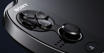 end.
end.
Everything in the PSVita’s design not only improves on its predecessor, but puts it to shame. The face buttons are nicely spaced and feel just right, and the d-pad is the best ever put on a Sony device. Gone is the 4-piece directional pad of the DualShock, replaced by one that – although aesthetically similar – is much more reminiscent of the pad from a Super NES controller, in all the best ways.
And let’s not forget the dual analog sticks. Discussions rage about the size and responsiveness of these two gorgeous little inputs, but all of them become moot about 5 minutes into a game of Super Stardust Delta. DualShock sticks they are not, and the nature of their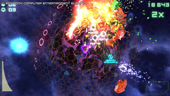 miniaturization means that they come with a necessary adjustment period. Once that few minutes is over, though… wow. Springy, responsive, and accurate – these portable analog sticks have it all. I’ll admit that, at times, they can be a little touchy, but I haven’t encountered anything outrageous, or even frequent enough to be annoying.
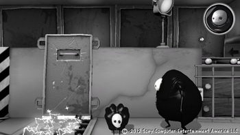
And, for good measure, Sony slapped multitouch panels on both the front and rear of the device as well as tilt sensors. The front touchscreen is stellar, responding to the lightest touch (sometimes it responds even before I feel like I’ve touched it) and operating as smoothly as any iDevice. The rear touch panel feels like an afterthought, but what the hell – it’s there and it offers developers more choice, so more power to Sony. While the rear touchpad offers loads of potential, I haven’t encountered a really spectacular or necessary use for it yet. It works fine for zooming the sniper-rifle in Uncharted and for knocking around obstacles in Escape Plan, but I’ll be interested to see if anyone 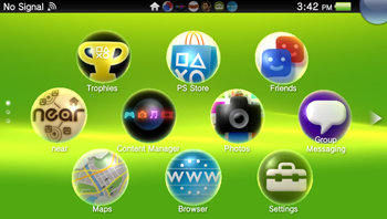 really makes it click.
The user interface is a departure for Sony, who chose to diverge from the last 7 or so years of the XMB into something much more touchscreen friendly. Sony’s new UI, much like their analog sticks, takes only a moment of adjustment before it all just makes sense. Imagine the iOS turned on its side: bubble-like application icons are arranged in three offset horizontal rows, and pages of apps scroll vertically rather than horizontally.
Multiple apps can be open simultaneously, and any that aren’t immediately in use are shifted to the side and suspended for easy retrieval. This is where horizontal scrolling comes in: a small row of icons at the top of the screen indicate how many apps are open, and a sideways swipe will take you to each one in order. 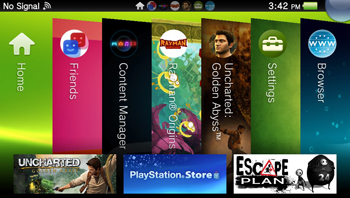 If you have a lot open and just want to find a single one, a click of the PS button will arrange them all into slots on-screen, looking very similar to the old Xbox “blades”. Tap a “blade”, and you’re off to that app.
Tapping on any icon doesn’t immediately start the app, instead taking the user to what Sony calls the “Live Area”, an intermediate – and mildly ingenious – page containing a start button for the title surrounded, potentially, by all kinds of dynamically updateable content. The Live Area for each app or game has a few standard icons, including links to the manual and software updates. It can also contain web-links, trophy lists, deep links directly to in-game features, leaderboards, or virtually anything else the developer can think of. Closing a suspended app is as simple as touching the upper-right corner of the Live Area and “peeling” the page away to the lower-left.
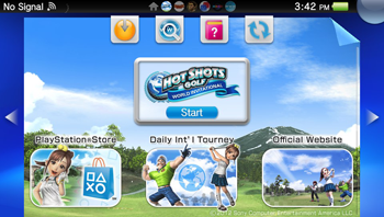 The interface is slick, offering a wealth of information in a relatively logical and easy-to-navigate layout. Like any new OS it’ll take time to learn the syntax, but it really is a great design for the device, and simple enough to be inviting for new users. I’m especially fond of the Live Area, and the potential it presents. Imagine popping into the Live Area for a multiplayer title and seeing a list of games your friends currently have open, each one a deep link taking you straight there rather than navigating in-game menus. Or links to daily events or downloads of new content.
You encounter all of these bells and whistles the moment you pick up the Vita. You can muck around in the main menu all day, emitting little “hmm”s and “oooh”s as you go, but it’s not until you start up a game that the Vita shows it’s true colors. And what beautiful colors they are.
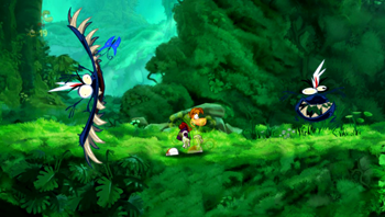 Gaming on the Vita feels like what portable gaming has always aspired to be. I’m not talking solely about console-quality gaming on-the-go, but that’s where I’ll start. We’ve had current-gen console-quality handhelds ever since the Sega Nomad and the TurboXpress, but the gaming experience on the Vita is like no other device on the market. Near current-gen quality graphics (which will only improve as devs learn the ins and outs of the system), more control interfaces than you can shake an analog stick at, and the most gorgeous screen ever put on a handheld gaming device, all adding up to as engrossing a gaming experience as you’ll ever find.
And that’s what’s really important: drawing the player in and making them ignore the world around them. Put in a pair of decent headphones, and you’ll quickly forget that you’re playing a handheld device. The Vita’s high-res 5-inch OLED screen is crisp and bright, and looks as good – if not better – than the screen on an iPad (although, admittedly, not as good as the iPhone 4’s retina display – but it’s damned close). Holding the Vita about a foot from your face (like most people will) results in an image equivalent to watching a 65-inch HDTV from about 12 feet – or about the length of most living rooms.
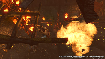 Yesterday, I sat on my couch and started playing a game of Uncharted: Golden Abyss at around noon, and didn’t stop playing until almost 2am. I’ve never been able to do that on any other handheld. Either my hands would cramp or my eyes would hurt or I’d just get bored. With the Vita, I felt just like I was playing Uncharted on the PS3, and only wanted to stop when I was too tired to play anymore – the device on which I was playing had faded into the background.
You’re probably wondering how I managed 14 hours of gaming on the Vita’s battery… Well, I didn’t – I was on my couch, so I was plugged in for that whole time. In my own personal experience over the last few days, I’ve been averaging around 4 hours of gaming per charge before I have to plug in, with the screen at about 75% brightness and Bluetooth turned off (although I wouldn’t be using it anyway). Wi-fi was on, and I’d access my trophies and friends lists amongst that time. 4 hours isn’t the best, but it’s not bad – and it’s about the same amount of gaming I get out of my 3DS with 3D turned on, so it doesn’t really phase me.
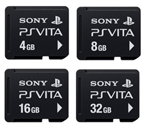 The price of Sony’s proprietary memory cards might be a challenge, especially if you want to download every game you buy like me. Different bundles can net you a memory card alongside the system (like the 3G Launch Bundle), but buying them standalone will cost you a minimum of $19.99 for 4GB, all the way up to $99.99 for 32. Yeah, that price is pretty outrageous, especially when the target audience for the Vita knows better; A 32 GB Micro SD card can be obtained for less than $1 per gigabyte. Your choice of memory card will be based entirely on your budget, and on how you intend to purchase games.
I went for the $99, 32 GB card because it’s my intention to never buy a single physical game for this system. I’ve heard the arguments: in order to recoup the cost of the memory card I’ll have to download at least 20 games which, on average, run about $5 cheaper than their physical counterpart. But the other thing I’m saving is space. I don’t need to keep boxes on a shelf (and yes, I understand the arguments of those who want the boxes, but that’s not me) and I don’t have to figure out extra storage space for cards. I can have a case that slips around just my Vita, and I’m good to go with my entire library. Besides – reaching 20 games isn’t going to be hard. I’ve already got seven.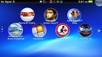
When you move away from gaming on the device is where it shows its flaws, primarily with the preinstalled non-game related apps, which are almost universally rubbish. The web browser is awful, the music and video players are only adequate, and the photo app is hindered by mediocre on-board cameras. The worst miss of the lot, though, is Near, Sony’s pseudo-GPS fueled social app that supposedly has functions similar to Nintendo’s Streetpass, but good luck finding out how they work. The app is nearly (ha ha) incomprehensible, with a needlessly obtuse interface that could have been so much nicer if it had just been simple.
Some will be concerned about the price. Starting at $250, it’s getting up there for the average gamer. It’s a tad more expensive than other handheld devices, but it doesn’t come nearly up to the price category of devices like the iPad. But let’s remember: When that $250 price point was announced, against the then-$250 3DS, the gaming community was singing Sony’s praises. Only when the 3DS’s price was radically slashed did the attitudes of gamers and journos alike seem to backpedal. And keep in mind, it’s not $250 for a dumbed down or half-assed version of something better. The only question becomes: do you get your money’s worth?
Absolutely.
In a tech industry that is moving toward tablet devices that can do almost anything a casual user would want, gamers have been screaming about the dilution of their favorite pastime and the lost of the control mechanics that make more hardcore games unique. The Vita brings this all into sharp focus, giving us a device that’s built for gaming. It’s not a casual social tool, it’s not a tablet PC built for on-the-go word processing, it’s not a hyped-up e-reader, and it’s not a phone.
 What it does offer is the potential to be all things to all gamers: a place where the hardcore can cut a dual-analog path of destruction through a South American jungle in search of fortune and glory, where fighting game fans can revel in a clicky and responsive d-pad to pummel opponents online, or where casual gamers can touch-screen their way through a backyard full of zombies or a field glittering jewels. While the PSVita has its flaws they are few and minor, and it triumphs at what is clearly the focus: gaming. Want classic games from a bygone era? It can do that (not yet, but it can, damnit). PSP games? Sure, why not. Touchscreen titles that you love from tablets or the iPhone? Yeah, it can do that, too. Oh, and full-fledged, cutting edge modern gaming titles with no compromises? Sure, the Vita’s got you covered. Online play, PSP games, trophies, and full PSN support including your friend list are all in there too.
The PSVita is close to ousting the Game Boy Advance SP Bright as my favorite portable gaming system of all time – and I’ve only had mine for five days. The launch lineup is brilliant (at least, for an American audience) showing off a little bit of everything the PSVita can offer. What’s really got me hooked is the PSVita’s potential, though: With a screen, UI, and controls that require no compromises, the system is capable of playing host to anything gamers want from the past and present, and offer developers worlds of possibilities for the future.

