I cross-posted this article at ChroniclerSaga.com.
I am completely OCD about quality. Sometimes, that can be a bad thing. I have trouble releasing things I’m working on, especially artistic works. I’m fairly positive that this trait is what pulled me away from being an illustrator; I was never, ever satisfied with things I’d draw, and couldn’t accept the flaws in my work. When writing CONSTRUCT, this manifested itself in seven full drafts comprised of a ton of interim revisions. Had to be done.
Typos, bad formatting, terrible covers… ugh. Seeing that an author or a publisher has put absolutely minimal effort into their book’s aesthetic is off-putting, to say the least. A bit more can be forgiven in the case of self-published authors; it’s hard enough just jumping through the hoops to get the book released. But to see a minimally-formatted, slap-dash eBook from a major publisher is in-fucking-furiating.
 The various distributors of eBooks have built systems that make it extremely easy to release your prose to the world. In developing a system centered on ease, however, they’ve sacrificed aesthetics. For the vast majority of self-published authors – and, for that matter, most big publishers translating physical copy to digital – that doesn’t matter. Ease is all that counts, and as long as the text is readable, who gives a damn how it looks?
I DO.
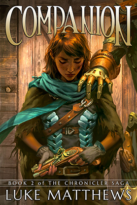
First and foremost, I wanted a traditional cover for my novel. The rise of Photoshopped stock images on book covers makes me die inside a little, especially for fantasy novels. I grew up on covers by Vallejo and the Hildebrandts, so I knew I’d never be satisfied with a $30 stock cover design or a Photoshop disaster. As you can see in the cover reveal I posted a couple of weeks ago, my cover artist Carmen absolutely nailed the artwork for this book, and I couldn’t be happier.
Like I said, I’m a quality nut. Once I’d made the decision to self-pub, I did a ton of research on eBook formatting, and how your formatting is affected by the various processing software provided by Amazon, Barnes & Noble, and others. The almost-universal opinion of the output of these services hovers somewhere around “Meh. It works, I guess.” But even with that feedback, many self-published authors see the output of those processors and just throw up their hands, giving in to whatever minor victories they can eke out of a shitty system.
 I didn’t want to be hamstrung by what those companies could provide, so I delved into the process of doing the formatting myself. Details, details, details. I learned how to convert a manuscript on my own, using an open source eBook management program called Calibre. Even the output from Calibre was mediocre, mostly because it requires a ton of in-depth knowledge of Calibre’s settings and features, and how they interact with the input file. I was able to get a passable result, but nothing special. I began looking for a way to do my own tweaks. I have a reasonable knowledge of HTML and CSS, and eBooks are pretty much just self-contained HTML files. I found an eBook WYSIWYG editor called Sigil, and I was off to the races.
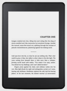
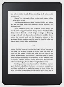
Sigil allowed me to alter the book at the code level, and I was in heaven. I was able to futz with every single little detail, burying myself in the minutia. Everything from the placement of chapter headings to indents to line spacing to the horizontal rule at the beginning of every chapter. I refined and tinkered the living shit out of the code for this book, and I think it shows in the finished product. On top of satisfying my OCD, it was just plain fun.
How a book looks when you’re reading is important. Typos and bad formatting detract from the reading experience. Everything about a book should melt into the background except for the words on the page, and every time you run across a misspelled word or an awkward paragraph break, it pulls you out of the immersion. Even if readers don’t actively notice the work I put into the formatting, I’ll be happy if they just don’t notice the formatting at all.
If it’s invisible, I’ve done my job.

