Luke Matthews is a writer, board gamer, beer drinker, and all-around geek. He currently lives in the Seattle area with his wife, two cats, and two German wirehaired pointers.

Review: Seven Warriors #1


Story by Michael Le Galli
Art by Francis Manapul

Seven Warriors, a historical fantasy tale set in the fictional north-African kingdom of N’nas Amon during the middle ages, begins at the fall of the capitol city of Tamasheq. Queen Tsin’inan recruits a crew of six female Sarmatian warriors to escort her son to the hidden city of Jabbaren, away from the danger of the impending war.

Amongst all of the historical references and abundance of apostrophes, Seven Warriors is a simple adventure tale. Le Galli laces the story with excessive dialogue at times, spending a few too many words explaining somewhat straightforward situations. The book begins on a sex-scene that the writing in the book never adequately explains, relying on artwork that doesn’t fully clarify its place in the story. The story picks up pace once the introduction to the world is handled, but perhaps not enough. The end of the book feels forced, ending in a cliffhanger that creeps up almost as an afterthought.

Francis Manapul’s art is strong throughout, evoking Michael Turner-esque style of his Aspen and Top Cow roots. The story is as much about its environments as its characters, and Manapul doesn’t skimp. From the ancient city of N’nas Amon to an alpine snowscape to a long-forgotten underground passage, the book’s environments are given solid attention to detail. Unfortunately it’s sometimes difficult differentiate some of the characters, leading to the aforementioned confusion regarding the book’s opening.

It is of note that the book is also presented in a strange square format, reminiscent of Archaia books like Mouse Guard, but still printed at standard size. This leads to large bars of blank white at the top and bottom of every page, almost like letterboxing, and feels like a lot of wasted space.

The last few pages of Seven Warriors can be forgiven when taken as a set piece in a larger tale. Although this wasn’t the strongest first issue, there’s potential for a fun medieval adventure if the right beats are put in place.

Review: Orchid #2


Story by Tom Morello
Art by Scott Hepburn

Intellectual escapee Simon and headstrong prostitute Orchid, along with Orchid’s little brother Yehzu, have been captured and sold into slavery. Although Simon insists that escape and rebellion are not only possible, but right, his words fall on the deaf ears of his broken fellow slaves. Moments before being sold at auction, Simon devises a plan to escape and gain entry to Fortress Penuel, where he will mount a rescue of the rebel leader Anzio…

While the first issue of Orchid, by necessity, focused on introductions and world-building, Morello spends significantly more time building on the personalities of his protagonists here. Simon is a know-it-all who runs his mouth too much, and spends much of his time confusing Orchid into discounting his ideas. Orchid is stubborn to a fault, single-mindedly focused on her and Yehzu’s survival after their mother’s murder. The character moments can be heavy-handed but they work, and never distract from the budding adventure at hand. The historical asides help to build Morello’s post-apocalyptic vision – one that is not devoid of life but teeming with it, and all of it dangerous – and serve to provide context for “present day” events.

Hepburn’s art is strong throughout, an interesting mix of gritty and cartoony that serves the character depictions well. His character designs are intriguing and distinguishable, and his monsters are suitably scary – whether they be animal or human in nature. His backgrounds are lush, showing us the swampy remains of a once waterlogged world rather than the standard desert terrain typical of the genre.

Orchid has its flaws – primarily in dialogue – but a lot of story is told in a small amount of space, and the world being built is a unique blending of different sci-fi and fantasy genres that, so far, works well. A new character introduction at the end of the book leaves us on a great cliffhanger, eagerly anticipating next month’s issue.

Review: The Occultist #1


Story by Tim Seeley
Art by Victor Drujiniu

Rob Bailey is a successful college student with a beautiful girlfriend. Everything was going his way until he was possessed by an ancient spellbook called the The Sword that grants him magical powers. A suspect in the murder of one of his professors, Rob must figure out what The Sword – and its pursuers – want with him while avoiding any police entanglements.

The Occultist #1 picks up immediately following the events of The Occultist #1. If that sentence confused you, imagine how I felt reading the book. It was originally a Dark Horse one-shot in 2010 that, while critically well received, didn’t make much of a splash. Unfortunately, this new start reads too much like a second issue, dropping readers into conversations and situations that require far more setup than the meager intro paragraph can provide.

Tim Seeley, typically deft at blending comedy and action in his creator-owned Hack/Slash series, misses the target for much of this issue. The lack of successful humor could be forgiven if balanced by tension, but even the action and horror scenes merely plod along, attempting to toe the line between exciting storytelling and necessary exposition but failing at both. The result is a lack of narrative arc that’s absent of stakes.

Drujiniu’s art is solid, and Dalhouse’s colors give it a painted feel that’s well suited to the material. One panel gives us a glimpse of Drujiniu’s traditional style, though, which I’d like to see shine through a little more. Unfortunately, two characters in the book look distractingly like celebrities (Rob’s roommate as portrayed by Anthony Anderson, and an eyepatched menace that’s clearly William Fichtner). One of the character designs – a bounty-hunter that looks like a girl in “female Indiana Jones” cosplay – is just absurd.

I feel like The Occultist is floundering for a direction. The creative team either needs delve into a grittier interpretation or embrace its absurdity. As it stands, though, it’s just a little bland.

Review: Abe Sapien: The Devil Does Not Jest #2


Story by Mike Mingola and John Arcudi
Art by James Harren

Concluding the short mini-series, Abe Sapien: The Devil Does Not Jest #2 picks up immediately after the unfortunate lapse in Abe’s focus that landed him in hot water at the end of the last issue. He awakes injured and hallucinating, conversing with the ghost of a dead demonologist.

The presentation of this conversation is excellent, providing a well-crafted fantastical framework for some necessary historical exposition. It’s an interesting look at the subject of the first issue, and leads us directly into the events of the second half of the book. That transition was a tad confusing, though, and it took several re-reads to really understand. Once that was handled, the rest of the book is a fun, old-fashioned monster bash.

There is a very small side note of a story featuring Salvatore Tasso and Hellboy that could have been left out of the issue entirely. It feels pointless in the context of Abe’s story, and only inserted for a lame punchline in the last panel that actually serves to weaken the payoff at the end of the book.

James Harren’s artwork is considerably stronger in this issue than the first. The historical segments and hallucinations are well rendered, and one particular panel involving a demonic transformation is exceptionally creepy. His monster designs are suitably gruesome, and his action during the primary fight sequence is kinetic and engaging. I was pleased with the art throughout, which is well complimented by Dave Stewart’s colors.

As an individual issue, this one weighs in a little light, but it’s a better-than-average conclusion to the overall tale. I think this story would have been well served by editing it down to a fat one-shot rather than splitting it over two issues.

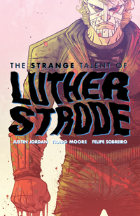
The Strange Talent of Luther Strode #1 Review

Story by Justin Jordan
Art by Tradd Moore

What if… Just, what if those bodybuilding methods from all the comics in the ‘70s & ‘80s really worked? That’s the question that The Strange Talent of Luther Strode asks and attempts to answer. Tucked into your favorite book alongside superheroes schilling fruit snacks and pages of the most random joke toys you’ll ever imagine is an ad for The Hercules Method, a quick-fire way to turn flab to slab that might really have something behind it.

Luther Strode is your standard high-school nerd. A lanky kid with a self-deprecating sense of humor whose nerdy best friend Pete is constantly getting him into more trouble than he wants, but never too much for him to wiggle out of. He has his requisite crush: the pierced, punk-rock-y redhead Petra, who might very well be a little into him too, if he can grow a pair and talk to her. So, to make himself more appealing and give him the confidence he needs, he orders himself a copy of The Hercules Method.

Amongst all of the amped up hyper-violence in the first issue of Luther Strode (the book opens on a scene filled with severed limbs, entrails, and a sea of blood) the parts that make it work are the tiny little character moments. Interactions between Luther and Pete are allowed room to breathe, developing their friendship without cramming it down the reader’s throat. Petra is shown to be deeper than the out-of-reach hot girl, and Luther’s mom is carrying the weight of some recent trauma that is not fully explained, but very well understood.

Justin Jordan trusts his readers to come to conclusions on their own, a rare trait in comic writers these days. He gives us the right glimpses of the right conversations, allowing the backstory to seep into the crevices of our imaginations naturally. This approach brings us closer to the important characters because we almost unconsciously make them real by filling in the blanks ourselves.

Tradd Moore’s art is an excellent compliment to Jordan’s script, falling smack dab between Ryan Ottley’s hard-edged superhero work and Rob Guillory’s whacked-out proportions. His linework is tight and accurate, with just enough of a cartoony bent to take the edge off of the violence and add that over-the-top feel it needs to be entertaining instead of just gross. He is equally adept at nerdy kids in a high-school hallway as his is at grotesque mummy-men in chain-bound captivity.

Felipe Sobreiro’s colors do an exceptional job of accentuating Moore’s breakdowns, imbuing each scene with tension and excitement where necessary and calming things down when action isn’t on order. Finch adds several shifts in the overall palette to differentiate scenes in both location and content without making the shifts feel gaudy or out of place.

In many ways, the beginning of Luther Strode may be compared to Mark Millar’s Kick-Ass, and rightly so. Although those comparisons are legitimate, I think that Jordan’s characterizations are warmer and more interesting and his protagonist more identifiable. The storyline is fun and engaging and the art is tight and appealing. The Strange Talent of Luther Strode is one of the better books Image has released this year, and definitely worth a pick-up.

Review: Superior #5


Story by Mark Millar
Art by Leinil Yu

Issue #5 picks up with Superior on his way into Afghanistan, ready to take care of the business that the U.N. cannot seem to complete. The remainder of the issue is a series of vignettes showing Superior well on his way to solving all of the world’s problems, all the while taking the time to live out every single Make-A-Wish Foundation fantasy he can imagine.

In preceding issues, Millar played up the relationship between Simon and Chris and the superhero story suffered, feeling a little too derivative of Superman. In issue #5 he turns the tables, and I’m not sure it’s for the better. Simon’s relationship with Chris is almost completely sidelined in favor of the superhero tale, which Millar cranks up to 11 with Superior jet-setting across the world performing impossible humanitarian feats directly in contrast to his previously small-time offerings. Even Maddie Knox’s role in the issue is suspect, stripping her of what little depth she had built until this point. The build-up feels like a shallow lead-in to the book’s punch-line, serving up one (although likely not all) of Ormon’s machinations in an ultimately underwhelming conclusion.

Leinil Yu’s art is excellent, with only a few dips in his standard level of quality. I am consistently impressed with Yu’s depiction of Superior as a cross between Superman and Shazam, and one early panel gives us a subtly elegant portrayal of the excited young boy inside the marble-jawed superhero exterior. The artwork is unfortunately marred by Sunny Gho’s heavy-handed coloring, which at times distracted me from the story.

Although Superior has never been the deepest comic on the shelves, this latest offering feels even more shallow – a haphazard means to an end rather than an intriguing character tale. I’m still interested to see where it leads, but this single issue fell flat for me.

Review: Vescell #2


Story by Enrique Carrion
Art by John Upchurch

Vescell #2 is split into two separate, unrelated stories. The first is a tale of a vengeful high-school girl who plots to steal her cheerleader sister’s life, and is ultimately foiled by Moo and Machi. In the second, Moo is called in by Vescell to assess a client for v-trans (a consciousness transfer into a new body) – only this time the client is an artificial intelligence. He denies the claim, and hilarity ensues.

Carrion’s characters lack any depth and are entirely unsympathetic. In the first story, Moo and Machi brutally kill two people – one of which was a high-school jock who was more dumb than evil – with no explanation of why they deserved such a fate. Moo just tramples blindly forward on orders, no consideration given to the scope or consequences of his actions.

The text in the second story is excessive, comprised entirely of exposition paired with a healthy dose of eye-rolling absurdity (an assassin fighting off an attacker with a dildo?). One conversation consisted of some chunky dialogue overlaid on top of a two-page sex scene, actually making me wonder if they’d accidentally mis-paired the text and imagery. There’s even a page that I had to re-read multiple times because it breaks the basic rules of panel-flow.

Upchurch’s characters are generally well constructed, especially facially, but their overall designs are rather boring. The rest of his artwork is just bland, a problem not helped by his almost religious aversion to drawing complete backgrounds. If a panel contains any background at all (most are just a slate of color), it is usually blurred rather than finished.

Vescell #2 as a whole is just a mess. The makings of an interesting high-concept sci-fi noir tale are here, but they’re buried beneath a heap of poor execution, shallow dialogue, and blatant immaturity.

Comic Shop Cardinal Sins: Ordering Blunders

We’ve all been there: The seedy, low-rent comic shop that looks like the bastard love-child of a hoarder’s garage sale and a disaster site. Comics, toys, games, and t-shirts are haphazardly arranged in no discernible organizational style. Back issue boxes are virtually inaccessible, covered in random detritus. Aisles are so narrow and crammed with so much flotsam that the slightest mistake could lead to a Wall-E style garbage heap collapse. And, to top it all off, the guy behind the counter can’t be bothered to look up from his copy of Beyond Wonderland long enough to answer a simple “Do you guys have the latest issue of The Sixth Gun?”

Local comic book shops are an interesting breed of retail establishment. In an industry that thrives on repeat customers driven by intense fandom, a successful comic shop must toe the line between catering to the hardcore fanbase and serving new potential customers without scaring them away. It’s a tough tightrope to walk, but success can be accomplished with proper attention to the right details.

In this entry, we’ll discuss a problem that can lead to many others: Ordering Blunders.

It’s hard to fault a store for their ordering practices. Comic shop owners drift in a murky space between savvy, organized businesspeople and tea-leaf-reading basement psychics. I don’t mean this in a derisive way – this is simply to say that not all ordering decision are, or even can be, based on hard numbers in the comic book industry. Many decisions are based on gut feelings and knee-jerk predictions. Comic fans are flighty, and can cause streaky waves in popularity. One month a book may languish in obscurity without so much as a second glance by a customer, while the next month’s issue will fly off the shelves and create a demand for back issues. These kinds of natural fluctuations in the tastes of comic shop customers are difficult to predict, and even harder to adjust to in any kind of timely fashion.

Every comic shop owner has made an ordering mistake at some point. Maybe they over ordered expecting a surge that didn’t come, or they didn’t understand that because Mars was in equinox and Sagittarius was in arabesque behind Orion, there would be a sudden influx of customers asking desperately for the latest issue of Executive Assistant Iris. In spite of this, there are two major ordering blunders that aren’t about market fluctuations or finicky customers, and rest entirely on the shoulders of the shop owner’s stubbornness. The first of these issues is

Taste-Based Ordering

This is an issue that generally only occurs at the much smaller, single-owner-operator type shops. The bigger stores with bigger customer bases usually have a handle on what readers want, and will also have a staff of employees able to help determine what is popular. The little guys, though, don’t always have the greatest grasp of what their shoppers want, and so are more apt to foist their own tastes onto their patrons.

One store I visited recently (which I will refer to henceforth as our Villain, because I’ll likely talk about them frequently) had well over 30 copies of the then-latest issue of Sweet Tooth on their shelf, but when I asked about current and back issues of Uncanny X-Force, the response I received (and I’m paraphrasing a little because of my rotten memory) was “I didn’t really order much of that ‘cause I didn’t think much of it.” When I went back to their current issue racks, I saw that there were stacks upon stacks of unsold back issues of Sweet Tooth cluttering up the shelf.

Now, I’m not impugning Sweet Tooth in any way: It’s an excellent book and one that I wholeheartedly suggest you check out. And I could be talking out my ass here, but I don’t think it’s a runaway blockbuster that’s going to churn 30 copies – in addition to subscribers – for a hole-in-the-wall comic shop. I mean, it clearly wasn’t doing so for our Villain. On top of all that, Uncanny X-Force is a consistently excellent book from the largest publisher in the world, that has name recognition with the legions of X-Fans in our little community.

Yet, it wasn’t ordered because the shop owner “didn’t think much of it”. Not to be rude, but it frankly doesn’t matter what the shop owner thinks of a book – it matters what the customers think. Pay attention to trends. Listen to what people are asking for. Promoting a book that you like is never a problem, but do it right; Don’t just dump a huge pile onto your racks and expect them to fly off the shelves. Most of all, make sure that you have the popular stuff on the shelf, not just in subscribers’ boxes, for walk in customers.

This leads me into the second blunder:

Severe and Consistent Under-Ordering

Although this doesn’t happen too often for box customers at their own regular shop, how many times have you walked into another shop and asked for a book, only to find out that the owner only ordered enough for his subscription boxes? This is acceptable and excusable once or twice, or maybe for a few of the more clearly obscure titles, and almost never happens with blockbuster titles like Ulitmate Comics Spider-Man or The Walking Dead.

But I’ve been to shops where I was unable to find a copy of popular and exceptional independent titles – The Unwritten and Irredeemable come immediately to mind – because they only ordered enough for their subscription boxes and no more. None. Not even one, that they could have told me had already sold. And not just once or twice, but on a consistent, month-to-month basis. Once, after finding out that a shop I’d visited (our Villain once again, oddly enough) didn’t have the latest issue of The Sixth Gun, I asked how many of their box customers received the book, to which the owner replied “19 or 20”.

19 or 20!? Wait just a minute! You have subscribers in the double digits ordering this book, and you didn’t think that it would generate enough popularity – or, hell, even recommendations – to warrant even a few shelf copies? The absurdity of this scenario makes my head spin, and I’ve encountered similar situations multiple times over the years.

If I am continually walking out of your store having not found the comic I’m looking for, what reason do I have to return? I get quickly fatigued by the phrase “we can order it for you if you want”. That’s not why I’m here! If I wanted to wait for shipping, I’d have ordered it on the ‘net my own damn self. If I can consistently return to a shop and find the things I want, I’ll be infinitely more likely to start a subscription shelf there. Which, incidentally, is exactly what happened with my current shop.

You’re Not A Collector

I understand that there are perfectly reasonable explanations for these issues on a case-by-case basis, and I also understand that shop owners aren’t perfect. However, you can’t just throw your personal collection into a space and call it a comic shop. You’re not a collector when you’re at your store, and you’re not just recommending books to your friends. There’s a business to run and customers to serve whose tastes and flighty buying habits will vary wildly both from yours and from each others.

Don’t expect your customer base to have the same taste in books as you, and don’t cater so heavily to your subscribers that you forget the whole reason why you have new issue racks in the first place: potential new buyers that will allow you to expand your business.

Comic Shop Cardinal Sins: Organizational Folly

We’ve all been there: The seedy, low-rent comic shop that looks like the bastard love-child of a hoarder’s garage sale and a disaster site. Comics, toys, games, and t-shirts are haphazardly arranged in no discernible organizational style. Back issue boxes are virtually inaccessible, covered in random detritus. Aisles are so narrow and crammed with so much flotsam that the slightest mistake could lead to a Wall-E style garbage heap collapse. And, to top it all off, the guy behind the counter can’t be bothered to look up from his copy of Fangoria long enough to answer a simple “Do you guys have the latest issue of Invincible?”

Local comic book shops are an interesting breed of retail establishment. In an industry that thrives on repeat customers driven by intense fandom, a successful comic shop must toe the line between catering to the hardcore fan-base and serving new potential customers without scaring them away. It’s a tough tightrope to walk, and attention to the right details is an absolute necessity.

The focus of this week’s article: Organizational Folly.

Let me begin by saying that this entry won’t cover stores that don’t even attempt to organize – I’ll hit that subject in Clutter, Clutter, Clutter. For now, I’m going to focus on stores who make baffling and frustrating choices in how they organize what they do have in their store.

Nonsensical Divisions

Some divisions are logical, the simplest being to just alphabetize your entire stock regardless of other factors. Dividing by publisher makes sense as well, and is probably the most common division used by the average local comic shop. Virtually all shops have an “indie” section, mixing the books from smaller publishers like Boom! Studios or Oni Press.

What about the major-label imprints like Icon or Vertigo? Do they belong with their parent company, or in the indie section? I suppose arguments can be made either way, but putting them in with other “indie” or creator-owned books doesn’t seem to make sense. If you’re going to separate by publisher, separate by publisher. Just because Vertigo books tend to be more oddball or mature doesn’t make them indie.

Also, don’t put your new releases on a separate shelf from your standard organizational scheme. If I’m looking for the newest issue of The Walking Dead, I’m going to go to the same place where all the other issues of the Walking Dead normally are. When I don’t find the newest issue there, my first thought is that it must be sold out. Making me look in two different places for “new” issues versus “recent” issues is annoying, and can lead me to just give up on finding something.

Current Issue Stacks

One of the most aggravating organizational blunders is deep stacks of current issues cluttering up the shelves. These stacks can happen for two main reasons: over ordering of an individual issue, or leaving too many issues mixed in on the “current” shelf. In either case, archive. If an issue is more than 6 months old, it belongs in a back-issue bin.

Invariably, these giant stacks start sliding around, mixing with other books or falling off the shelf, potentially damaging the books and/or causing patrons to have to shuffle through giant, disorganized stacks to – in all likelihood – not even find what they’re looking for. Archiving laziness leads right into my next subject…

Lack of Maintenance

This is probably the most common problem with smaller independent shops. Take pride in what’s on your shelf, and work hard to maintain your organizational scheme, regardless of what it is. Be more organized than the geeks that come in and ruin your setup. Customers will invariably pick up books and put them back in the wrong place, knock something over while searching for a particular book, or just be outright sloppy and inconsiderate.

Every evening after closing, fix any organizational issues that customers have caused. Every morning before opening, make sure everything’s in order. It shows that you care about your shop’s content and, by extension, your customers.

“The Long Shelf”

This one might just be my own pet peeve, but is probably the worst organizational scheme in existence and the most off-putting for a customer. The “Long Shelf” occurs when, for example, a shop has one long wall that contains all of their current issue racks. When the comics on those racks are alphabetized, they are placed in one long line across the entire top shelf, from one end of the store to the other. Then, when that shelf runs out, the next letter starts a new shelf clear back on the other side of the store like some sort of giant, infuriating typewriter drum.

This is especially frustrating in a store whose racks already contain natural divisions every 3 or 4 feet. Use these divisions! Nobody wants to walk back and forth across the entire store to find the book they’re looking for. Let me stand in front of a single shelf section and follow the natural alphabetization, each shelf acting like a page in a book rather than turning the entire wall into an irritating scroll.

The Ideal

I can go either way on separating books by publisher. I see advantages and disadvantages to it, but my preferred organization is simple alphabetization. With the preponderance of indie and creator-owned books, I may frequently know the title of something I’m looking for without knowing who it’s actually published by. This is especially true of the casual reader – someone looking for a book after seeing a movie – who may not even know the publishers at all.

In my ideal world, books would be simply alphabetized, and separated into individual shelf sections. Only 4-5 months worth of current issues would remain on the shelf at any given time – put the rest in back-issue bins. Put new releases in their normal slot on the shelf and just mark them, don’t put them in a different section. Last, but not least, put effort into maintaining your organization, and show your customers that you care as much about their experience in your shop as you do for the products you’re selling them.

Comic Shop Cardinal Sins: Introduction

We’ve all been there: The seedy, low-rent comic shop that looks like the bastard love-child of a hoarder’s garage sale and a disaster site. Comics, toys, games, and t-shirts are haphazardly arranged in no discernible organizational style. Back issue boxes are virtually inaccessible, covered in random detritus. Aisles are so narrow and crammed with so much flotsam that the slightest mistake could lead to a Wall-E style garbage heap collapse. And, to top it all off, the guy behind the counter can’t be bothered to look up from his copy of The Lost Girls long enough to answer a simple “Do you guys have the latest issue of Captain America?”

Local comic book shops are an interesting breed of retail establishment. In an industry that thrives on repeat customers driven by intense fandom, a successful comic shop must toe the line between catering to the hardcore fan-base and serving new potential customers without scaring them away. It’s a tough tightrope to walk, and attention to the right details is an absolute necessity.

Over the course of these articles, I’ll discuss what I believe are the cardinal sins that local comic shops should avoid to keep customers – new and returning – happy for the long run. There are very few shops I’ve encountered that manage to avoid all of these problems, but the ones that have come the closest tend to be the most successful. There are five cardinal sins that I’ll cover in the coming articles: Organizational Folly, Ordering Blunders, Employing Trolls, The Blank Stare, and ClutterClutterClutter.

I’ll start things off simple, with a problem that I consider to be half a sin:

Inconsistent Hours

I understand that the vast majority of local comic shops are sole proprietorships; small businesses run by one person or a small group of people. As such, it might be common for a shop to be unexpectedly closed, or closed during a lunchtime hour. These situations are acceptable – sometimes stuff happens, and you gotta do what you gotta do.

How many times, however, have you seen something like this:

    HOURS:
      Sun: 12-5
      Mon: 11-6
      Tue: 12-8
      Wed: 11-6
      Thu: 12-6
      Fri: 12-8
      Sat: 11-7

Really? Regardless of what you think your sales performance might be in the opening or closing hour of a day, your customers have to be able set reasonable expectations for your store’s availability. I shouldn’t have to look up my shop’s hours every single time I go there because I’m not sure what they could be that day. Set a reasonable, regular schedule.

And most importantly, stick to it. Just because your store is slow one night shouldn’t mean closing early. What happens to the guy who rushes down to the shop one night, only to get there five minutes before the posted closing time to find the shop shut down? I can’t count the number of times I’ve stopped by some of my local shops after work during the week, only to find that they’d bailed early. If I can’t expect consistency, I’ll find somewhere else to get my books.