Review: Orchid #2


Story by Tom Morello
Art by Scott Hepburn

Intellectual escapee Simon and headstrong prostitute Orchid, along with Orchid’s little brother Yehzu, have been captured and sold into slavery. Although Simon insists that escape and rebellion are not only possible, but right, his words fall on the deaf ears of his broken fellow slaves. Moments before being sold at auction, Simon devises a plan to escape and gain entry to Fortress Penuel, where he will mount a rescue of the rebel leader Anzio…

While the first issue of Orchid, by necessity, focused on introductions and world-building, Morello spends significantly more time building on the personalities of his protagonists here. Simon is a know-it-all who runs his mouth too much, and spends much of his time confusing Orchid into discounting his ideas. Orchid is stubborn to a fault, single-mindedly focused on her and Yehzu’s survival after their mother’s murder. The character moments can be heavy-handed but they work, and never distract from the budding adventure at hand. The historical asides help to build Morello’s post-apocalyptic vision – one that is not devoid of life but teeming with it, and all of it dangerous – and serve to provide context for “present day” events.

Hepburn’s art is strong throughout, an interesting mix of gritty and cartoony that serves the character depictions well. His character designs are intriguing and distinguishable, and his monsters are suitably scary – whether they be animal or human in nature. His backgrounds are lush, showing us the swampy remains of a once waterlogged world rather than the standard desert terrain typical of the genre.

Orchid has its flaws – primarily in dialogue – but a lot of story is told in a small amount of space, and the world being built is a unique blending of different sci-fi and fantasy genres that, so far, works well. A new character introduction at the end of the book leaves us on a great cliffhanger, eagerly anticipating next month’s issue.

Review: The Occultist #1


Story by Tim Seeley
Art by Victor Drujiniu

Rob Bailey is a successful college student with a beautiful girlfriend. Everything was going his way until he was possessed by an ancient spellbook called the The Sword that grants him magical powers. A suspect in the murder of one of his professors, Rob must figure out what The Sword – and its pursuers – want with him while avoiding any police entanglements.

The Occultist #1 picks up immediately following the events of The Occultist #1. If that sentence confused you, imagine how I felt reading the book. It was originally a Dark Horse one-shot in 2010 that, while critically well received, didn’t make much of a splash. Unfortunately, this new start reads too much like a second issue, dropping readers into conversations and situations that require far more setup than the meager intro paragraph can provide.

Tim Seeley, typically deft at blending comedy and action in his creator-owned Hack/Slash series, misses the target for much of this issue. The lack of successful humor could be forgiven if balanced by tension, but even the action and horror scenes merely plod along, attempting to toe the line between exciting storytelling and necessary exposition but failing at both. The result is a lack of narrative arc that’s absent of stakes.

Drujiniu’s art is solid, and Dalhouse’s colors give it a painted feel that’s well suited to the material. One panel gives us a glimpse of Drujiniu’s traditional style, though, which I’d like to see shine through a little more. Unfortunately, two characters in the book look distractingly like celebrities (Rob’s roommate as portrayed by Anthony Anderson, and an eyepatched menace that’s clearly William Fichtner). One of the character designs – a bounty-hunter that looks like a girl in “female Indiana Jones” cosplay – is just absurd.

I feel like The Occultist is floundering for a direction. The creative team either needs delve into a grittier interpretation or embrace its absurdity. As it stands, though, it’s just a little bland.

Review: Abe Sapien: The Devil Does Not Jest #2


Story by Mike Mingola and John Arcudi
Art by James Harren

Concluding the short mini-series, Abe Sapien: The Devil Does Not Jest #2 picks up immediately after the unfortunate lapse in Abe’s focus that landed him in hot water at the end of the last issue. He awakes injured and hallucinating, conversing with the ghost of a dead demonologist.

The presentation of this conversation is excellent, providing a well-crafted fantastical framework for some necessary historical exposition. It’s an interesting look at the subject of the first issue, and leads us directly into the events of the second half of the book. That transition was a tad confusing, though, and it took several re-reads to really understand. Once that was handled, the rest of the book is a fun, old-fashioned monster bash.

There is a very small side note of a story featuring Salvatore Tasso and Hellboy that could have been left out of the issue entirely. It feels pointless in the context of Abe’s story, and only inserted for a lame punchline in the last panel that actually serves to weaken the payoff at the end of the book.

James Harren’s artwork is considerably stronger in this issue than the first. The historical segments and hallucinations are well rendered, and one particular panel involving a demonic transformation is exceptionally creepy. His monster designs are suitably gruesome, and his action during the primary fight sequence is kinetic and engaging. I was pleased with the art throughout, which is well complimented by Dave Stewart’s colors.

As an individual issue, this one weighs in a little light, but it’s a better-than-average conclusion to the overall tale. I think this story would have been well served by editing it down to a fat one-shot rather than splitting it over two issues.

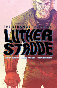
The Strange Talent of Luther Strode #1 Review

Story by Justin Jordan
Art by Tradd Moore

What if… Just, what if those bodybuilding methods from all the comics in the ‘70s & ‘80s really worked? That’s the question that The Strange Talent of Luther Strode asks and attempts to answer. Tucked into your favorite book alongside superheroes schilling fruit snacks and pages of the most random joke toys you’ll ever imagine is an ad for The Hercules Method, a quick-fire way to turn flab to slab that might really have something behind it.

Luther Strode is your standard high-school nerd. A lanky kid with a self-deprecating sense of humor whose nerdy best friend Pete is constantly getting him into more trouble than he wants, but never too much for him to wiggle out of. He has his requisite crush: the pierced, punk-rock-y redhead Petra, who might very well be a little into him too, if he can grow a pair and talk to her. So, to make himself more appealing and give him the confidence he needs, he orders himself a copy of The Hercules Method.

Amongst all of the amped up hyper-violence in the first issue of Luther Strode (the book opens on a scene filled with severed limbs, entrails, and a sea of blood) the parts that make it work are the tiny little character moments. Interactions between Luther and Pete are allowed room to breathe, developing their friendship without cramming it down the reader’s throat. Petra is shown to be deeper than the out-of-reach hot girl, and Luther’s mom is carrying the weight of some recent trauma that is not fully explained, but very well understood.

Justin Jordan trusts his readers to come to conclusions on their own, a rare trait in comic writers these days. He gives us the right glimpses of the right conversations, allowing the backstory to seep into the crevices of our imaginations naturally. This approach brings us closer to the important characters because we almost unconsciously make them real by filling in the blanks ourselves.

Tradd Moore’s art is an excellent compliment to Jordan’s script, falling smack dab between Ryan Ottley’s hard-edged superhero work and Rob Guillory’s whacked-out proportions. His linework is tight and accurate, with just enough of a cartoony bent to take the edge off of the violence and add that over-the-top feel it needs to be entertaining instead of just gross. He is equally adept at nerdy kids in a high-school hallway as his is at grotesque mummy-men in chain-bound captivity.

Felipe Sobreiro’s colors do an exceptional job of accentuating Moore’s breakdowns, imbuing each scene with tension and excitement where necessary and calming things down when action isn’t on order. Finch adds several shifts in the overall palette to differentiate scenes in both location and content without making the shifts feel gaudy or out of place.

In many ways, the beginning of Luther Strode may be compared to Mark Millar’s Kick-Ass, and rightly so. Although those comparisons are legitimate, I think that Jordan’s characterizations are warmer and more interesting and his protagonist more identifiable. The storyline is fun and engaging and the art is tight and appealing. The Strange Talent of Luther Strode is one of the better books Image has released this year, and definitely worth a pick-up.

Review: Superior #5


Story by Mark Millar
Art by Leinil Yu

Issue #5 picks up with Superior on his way into Afghanistan, ready to take care of the business that the U.N. cannot seem to complete. The remainder of the issue is a series of vignettes showing Superior well on his way to solving all of the world’s problems, all the while taking the time to live out every single Make-A-Wish Foundation fantasy he can imagine.

In preceding issues, Millar played up the relationship between Simon and Chris and the superhero story suffered, feeling a little too derivative of Superman. In issue #5 he turns the tables, and I’m not sure it’s for the better. Simon’s relationship with Chris is almost completely sidelined in favor of the superhero tale, which Millar cranks up to 11 with Superior jet-setting across the world performing impossible humanitarian feats directly in contrast to his previously small-time offerings. Even Maddie Knox’s role in the issue is suspect, stripping her of what little depth she had built until this point. The build-up feels like a shallow lead-in to the book’s punch-line, serving up one (although likely not all) of Ormon’s machinations in an ultimately underwhelming conclusion.

Leinil Yu’s art is excellent, with only a few dips in his standard level of quality. I am consistently impressed with Yu’s depiction of Superior as a cross between Superman and Shazam, and one early panel gives us a subtly elegant portrayal of the excited young boy inside the marble-jawed superhero exterior. The artwork is unfortunately marred by Sunny Gho’s heavy-handed coloring, which at times distracted me from the story.

Although Superior has never been the deepest comic on the shelves, this latest offering feels even more shallow – a haphazard means to an end rather than an intriguing character tale. I’m still interested to see where it leads, but this single issue fell flat for me.

Review: Vescell #2


Story by Enrique Carrion
Art by John Upchurch

Vescell #2 is split into two separate, unrelated stories. The first is a tale of a vengeful high-school girl who plots to steal her cheerleader sister’s life, and is ultimately foiled by Moo and Machi. In the second, Moo is called in by Vescell to assess a client for v-trans (a consciousness transfer into a new body) – only this time the client is an artificial intelligence. He denies the claim, and hilarity ensues.

Carrion’s characters lack any depth and are entirely unsympathetic. In the first story, Moo and Machi brutally kill two people – one of which was a high-school jock who was more dumb than evil – with no explanation of why they deserved such a fate. Moo just tramples blindly forward on orders, no consideration given to the scope or consequences of his actions.

The text in the second story is excessive, comprised entirely of exposition paired with a healthy dose of eye-rolling absurdity (an assassin fighting off an attacker with a dildo?). One conversation consisted of some chunky dialogue overlaid on top of a two-page sex scene, actually making me wonder if they’d accidentally mis-paired the text and imagery. There’s even a page that I had to re-read multiple times because it breaks the basic rules of panel-flow.

Upchurch’s characters are generally well constructed, especially facially, but their overall designs are rather boring. The rest of his artwork is just bland, a problem not helped by his almost religious aversion to drawing complete backgrounds. If a panel contains any background at all (most are just a slate of color), it is usually blurred rather than finished.

Vescell #2 as a whole is just a mess. The makings of an interesting high-concept sci-fi noir tale are here, but they’re buried beneath a heap of poor execution, shallow dialogue, and blatant immaturity.

Review: Lady Death #9


Story by Brian Pulido & Mike Wolfer
Art by Gabriel Andrade

After learning of New Abreffaw’s supposed alliance with the Death Queen, Hope throws away any idea of recruiting the independent city state to her cause and decides to burn it all to the ground. Before she can act, the general Behemoth and his monstrous legions attack the city, forewarned of Hope’s presence as well as that of the rebel leader Wargoth.

In truth, I was pleasantly surprised by the latest issue of Lady Death. Upon first glance, it could easily be written off as thinly veiled smut, but in spite of the abundance of well-endowed and scantily clad women, this fantasy tale carries an unexpected weight and charm along with it. While Wolfer’s scripting isn’t anything earth shattering, this latest issue is entertaining and culminates in real consequences for the lead characters.

While there is one gratuitous scene toward the beginning (two naked women somehow speaking to each other while kissing is a magical ability I was not heretofore familiar with), the remainder of the issue consists of a well-handled fantasy battle sequence replete with monstrous generals, giant fire-spewing spiders, and hordes of undead. The story is well-paced and entertaining, if mildly shallow.

The real draw here is Gabriel Andrade’s frenetic artwork. While his women are suitably sexy and his battles requisitely epic, he truly excels in the expressions and emotions of his characters, especially in a particularly wrenching moment of loss for one character late in the book. His posing and detail is excellent throughout, lending mass and movement to all of his embattled players.

While I’ve never been a fan of Lady Death, I’m intrigued by this issue. Although it was filled with primarily action, I’m impressed enough – especially by Andrade’s artwork – to seek out more.

Review: Danger Girl and the Army of Darkness #3


Story by Andy Hartnell
Art by Chris Bolson

Having lost the Necronomicon to an African warlord during a retrieval mission, Abbey Chase and the Danger Girl organization have followed their only lead – a page from the cursed book itself depicting an unknown man’s face – to a federal prison where their target is being held. The perfect sort of place for Abbey’s associate Sydney Savage to infiltrate…

After a far too lengthy introduction to Sydney, issue 3 of this franchise crossover finally leads into what we’ve been waiting for all along: a member of Danger Girl meeting up with Ash for the first time. Hartnell is clearly very comfortable with the Danger Girl characters; their dialogue is smooth with just the right hint of cheeseball, and their interactions carry the coolness that has always been the series’ appeal.

Ash, on the other hand, seems clumsily handled here. Although he’s meant to be a bumbling idiot, somehow his dialogue comes across immature rather than funny or goofy. He never feels quite like the dumbass turned badass he’s supposed to be, and never really captures the Bruce Campbell flair that made him so popular in the first place.

Sadly, Bolson’s art only adds to this effect. While he has a solid grasp on Abbey and company, Ash is inconsistently rendered throughout the book, never really feeling like the Ash we know and love. The artwork in the book is otherwise solid (although at times the colors are a little overdone), especially during the action-heavy sequences.

Overall, you’ll get what you expect out of this book. It’s a campy mash up of two diametrically opposed franchises that come together unexpectedly well, with a few stumbles in Ash’s portrayal. Danger Girl and the Army of Darkness is an entertaining throwaway, and worth at least one read-through.

Review: 50 Girls 50 #4


Story by Doug Murray & Frank Cho
Art by Axel Medellin

In the final issue of the 50 Girls 50 limited series, the women of the ESS Savannah open a wormhole to return home, only to find it occupied by an alien craft with which they are destined to collide. The lead-up to the collision is suitably tense, but everything that comes afterward is a jumbled mess of hackneyed dialogue and awful fiction-science.

The second half of the issue is filled with half-explained teasers, undoubtedly meant to drive readers to the hopeful ongoing series. Unfortunately these teasers lack intrigue, instead serving to frustrate and alienate. The end of the book is wholly unsatisfying, failing to provide any unifying thread to the random, one-off fight-fests of issues 1 through 3, and offering no closure to the crew’s story whatsoever.

Perhaps the worst offense of 50 Girls 50 was the almost offensive character arc of the Savannah’s crew. In issue 3 we’re given a glimpse into their seemingly power-mad view of their mission, only to have that viewpoint reinforced here as though it’s unfailingly correct. None of the women in the book think to question the mindset of their captain or Oksana, which makes them not only two-dimensional, but completely unsympathetic.

Even Medellin’s art, which I thought was excellent in the first issue, has steadily declined over the course of the series, feeling more and more rushed and sloppy. Where he initially succeeded in differentiating characters through unique attributes, his figures are now almost identically constructed and his facial expressions so muddied that his women are now defined by their hair color and styles.

Although 50 Girls 50 started as a potentially interesting sci-fi adventure with a unique twist, each issue of its four-issue run has quickly marked it as nothing more than a disappointing, monster-of-the-month schlock-fest.

Review: The Vault #2


Story by Sam Sarkar
Art by Garrie Gastonny

After excavating an ancient sarcophagus from the Sable Island pit, Dr. Gabrielle Page and her crew have discovered that its contents are not what they expected. This quickly leads members of Gabrielle’s team to take sides in the heated disagreement about how to proceed.

Sarkar effectively portrays a group of morally ambiguous characters whose motives are largely undefined, which leaves the reader scratching their head about who can be trusted. Unfortunately, this also has the side effect of making it difficult to know who to care about. When characters are put into jeopardy, the tension tends to fall a little flat without knowing who to root for.

As with any story of found horrors, a balance must be struck between environmental dangers and the perils of human interaction under extreme pressure. Sarkar does an admirable job finding this equilibrium, but a few characters’ reactions toward the middle of the book feel forced and somewhat unnatural.
This is also where the story falls apart, if only a little bit. After a major event changes the situation for everyone involved (I’m trying my best to avoid spoilers), I feel like the script gets very choppy, rushing to the end of the book and skipping around too much in the process.

The realism that Gastonny’s linework infuses into his characters is exceptional, and at times almost takes a back seat to his equally realistic environments. Where the script may fail at endearing these characters to me, the art succeeds at making them relatable and unique. The artwork is this book’s biggest draw.

Although The Vault is very reminiscent of other tales like The Abyss and Leviathan, I’m intrigued enough to follow it through to the end and see where Sarkar’s taking me.