Review: X-23 #10

Story by Marjorie Liu
Art by Sana Takeda

Picking up soon after the events of the X-23/Daken crossover, issue 10 follows Laura and Gambit as they travel to Paris with clues about X-23’s blood-soaked past. The summary page for the issue expects the reader to enter the story with the conceit that X is looking for more clues, or answers to clarify the clues she received at the end of the last story arc.

The issue, however, follows a different path: One that’s more about Laura’s deteriorating mental state and her descent into crippling angst than following her on her quest for answers. We’re given many opportunities to pause on Laura’s grief stricken face as she agonizes over her situation. At the very start of the issue, one such moment shows her cutting her own wrists in a restaurant bathroom, an irrational act which she knows will have no real effect, only deepening her disquiet.

Previous characterizations of X-23 have shown her to be deeply troubled, buried in her daily struggle to reconcile her new life with that of her old self, but never has the portrayal felt as ham-handed as it does here. Although she has much more trauma to cope with than any normal teen girl would, her character in previous issues has felt, with a few exceptions, much more grounded and determined. She was handed a gift-wrapped purpose by Daken in Madripoor, and yet she chooses to spend the following weeks wallowing in clichéd depictions of self-loathing.

I was disappointed with the turn in this book, and especially with the final scene. There is little character growth here for Laura or Remy, and the whole issue is feels a bit banal. A character taking a path I don’t like can be interesting, but this lacks any real depth or development.

Review: Brimstone #1

Story by Michael Lent and Brian McCarthy
Art by Hyunsang Michael Cho

Set in 1864 at the titular mining camp, Brimstone kicks off when a ruthless mine-owner kills a native holy-man with his first blast of dynamite, a blast that the holy-man was attempting to prevent. The requisite creepy warning is given, and the dying native creaks out some sort of incantation with his dying breath. Skip ahead a month and the settlement is set upon by shades, flying demons that kill everyone in town. We are transported to the mining headquarters where, after receiving a final telegraph from the doomed outpost, the head of the mining company recruits a ragtag band of ne’er-do-wells to find out what’s happened to his mine.

This first issue is mostly character introductions, a point that can be forgiven since it’s the start of the series. The problem lies in that those introductions are rather boring, and the book stumbles in its attempt to make the merry band of misfits interesting. Everything about them – from design to dialogue – lumps them all into shallow stereotypes with not even the hint of depth to come. The initial encounter consists of two of the characters flinging random racial epithets at one another while everyone postures ineffectually.

It doesn’t help that the artwork is wholly sub-par. Running the scale from simply murky to downright amateurish, the book just looks bad. Every page is loaded with unnecessarily strange angles between panels that are indistinguishably muddy. The few action sequences in the book are hard to follow, and do not bode well for a book that’s setting itself up for even more.

When it comes to Weird West comics, it’s difficult not to draw comparisons to the genre’s current frontrunner, The Sixth Gun. Where The Sixth Gun succeeds with eloquent dialogue and expressive artwork, Brimstone falls far short of both marks.

Review: Doc Savage #14

Story by J.G. Jones
Art by Qing Ping Mui

When you pick up a Doc Savage book, there’s no illusion about what you’re going to get. Pulpy and campy, Doc Savage always harkens back to its origins in the 30’s and 40’s, and little has been done to modernize the character or storylines save for technological references. The covers purposely evoke imagery from old serials, and vernacular used helps that right along (the phrase “big ape” appears repeatedly, and one character even spouts the word “hoosegow”).

This issue picks up as Savage and crew take on hungry, mind-controlled crocodiles while following the trail of an archaeologist nicknamed “Littlejohn”, who has been pressed into service to find a talisman called the Apis Bull. Littlejohn is kidnapped once again, Savage is set upon by thugs… again, and the story moves along at a brisk pace. There’s nothing exceptional here, but there’s nothing really wrong, either. The book is a fun, corny ride with a superficial but interesting-enough artifact driven plotline.

What really hurts the book is the artwork. Practically everyone Mui draws looks like a roid-raging Mickey Rourke, and the failures of proportion and perspective are sometimes jarring and far too frequent to ignore. Aside from hair and outfits the characters are indistinguishable, even from small side characters and the villains. I found myself wishing that J.G. Jones – whose lush cover artwork drew me into the book in the first place – were illustrating his own words.

As a pulp hero, Doc himself falls squarely between Indiana Jones and Dirk Pitt, fighting off genetically altered crocodiles as easily as mobs of random thugs, all while finding time to perform scientific analysis to help him on his quest. The story falls a little flat, though, and is irreparably marred by its imagery. If you are a Doc Savage fan you might see past the artwork, but I wasn’t able to.

Review: Breed III #1

Story and art by Jim Starlin

I’m not sure what to make of Breed III. The first two Breed story arcs were published in the mid-‘90’s under Malibu’s Bravura line. When Malibu went under, Starlin had a tough time finding anyone to pick up his story of a half-breed demonslayer, and maybe that was for the best.

I have no way of sugar-coating this, so I’m just going to say it: Breed III #1 is one of the worst comics I’ve ever read. It starts with a random battle interspersed with god-awful narration from our beastly hero, and is followed by an entire issue of Ray Stoner (yep, Ray Stoner) recounting his entire life story. To cap it all off the issue ends before he’s finished his tale, fortelling a second issue of further flashbacks.

From open to close, Breed III fails at every turn. Immature dialogue, ridiculous half-human-furries-gone-wrong as antagonists, a nonexistent plotline, and absurdities abound. The artwork and colors are outstandingly mediocre, looking astonishingly like… well, a mid-‘90’s Malibu book. Even the lettering causes more problems than it solves. On one jumbled two-page spread in particular, Ray recounts his birth and early childhood in such a haphazard layout that it’s almost impossible to figure out what to read next. The candle in the cupcake is a panel where the word “pastor” is misspelled (as “pasture”). Not once, but twice.

I wish I could say that this is a successful parody of the comics from which it was borne, but Breed III fails even when attempting to view it through that filter. If I can find anything positive to say about the book, my only thought is that at least it’s not offensive. Avoid this one at all costs.

Review: John Byrne’s Next Men #6

Story and Art by John Byrne

After our intrepid heroes are separated and flung backward through time, they find themselves fighting their way through some of the most brutal periods in human history. The focus of this most recent issue is Tony (who’s stuck in the Civil War-era south), given a chance to exact vengeance on the slave owner responsible for the unspeakable acts of trauma inflicted upon her in previous issues.

The issue opens with some of the most needless exposition I’ve seen in recent comic books. Tony spends much of the first several pages explaining every act she takes, even going so far as to offer open color commentary of every moment in her planned escape. Not narration, mind you: she’s actually speaking out loud.

The absurdity of the dialogue in these opening pages continues unabated as she is joined by the slave-owner’s granddaughter, who has decided to run away from home and joins Tony in her exit. Verity’s dialogue is a different style of frustrating: a stilted southern-speak that – while possibly accurate – comes across as overdone and campy. The addition of Verity to the party does give Tony someone to explain every little movement to, whether that’s a benefit or not.

After a lackluster opening run only slightly absolved by a few interesting twists, I was hoping that John Byrne’s Next Men would be on a path toward redemption. Issue 6 takes a giant step backward. It feels like Byrne couldn’t really figure an intriguing way to get from point A to point B, and just cobbled together a series of random events requiring extensive explanation. His writing is simultaneously insubstantial and heavy-handed, creating a fluff piece that serves no purpose but to lead into an unsatisfying punchline.

Review: Irredeemable #25

Story by Mark Waid
Art by Peter Krause

Irredeemable started as the story of the most powerful hero on Earth gone bad, and the stories of how his companions, his enemies, and the world react and adjust to his shift. The last few issues have taken a turn; a solid fly ball into left field. Issue 25 follows Plutonian and his newfound partner-in-escape as they fight their way through the multi-tiered-super-asylum-in-the-center-of-a-star where they’ve been imprisoned, paired with the story of Qubit and Modeus’s attempts to find where the Vespa have taken him.

The current storyline feels out of place, and this issue maintains that status quo. Modeus spends the first five pages explaining Plutonian’s powers, seemingly spurred by the notion that “No humanoid form of that size… is capable of storing enough energy to do what the Plutonian does.” While an interesting conversation that toes the line between science and fiction, I have to wonder if it was really necessary.

As the two discuss, Tony fights, and we see that the interdimensional sanitarium is filled with creatures easily as powerful as he is. In spite of the explanation of Plutonian’s powers (and his true knowledge of them), I can’t help but feel disappointed that Waid introduced us to this place and its inhabitants. Much of the mystique of Plutonian – everything that made him a unique threat – has either been explained or made commonplace.

It feels like the purpose of Irredeemable #25 was that explanation. While it adds a layer of tension to Tony’s mental state, it doesn’t feel like enough to drive the story forward. Tony, Qubit, Survivor and Modeus’s intersecting storylines are interesting in themselves, but are hampered by the outlandish setting they’ve been placed in. I only hope that Waid can drive the book back up out of the mire into which it seems to be sinking.

Review: Mouse Guard: The Black Axe #2

Story and art by David Petersen

Mouse Guard: The Black Axe is a prequel tale, telling us the origins of the beloved Celanawe and times long before he became the savior of Lockhaven. Issue two picks up as he and Em, a long lost cousin, travel to Port Sumac to procure travel across the North Sea in search of the legendary – and missing – axe. There they meet Conrad, a boat-mouse of questionable honor, but one whom Celanawe is able to lightly manipulate into bearing them across the unknown free of charge.

Petersen’s dialogue flows easily and gives an unquestionably noble air to his rodent characters, adding depth and richness to the world they occupy. This comes across especially well with Celanawe’s narration: you can envision the aged hero curled in a rocking chair in his twilight years, regaling the younger guard-mice with tales from his youth. The time spent in Port Sumac in this issue is some of the most interesting in the Mouse Guard series, presenting us with this world’s version of a pirate’s cove that comes across as dangerous, but never as seedy as in more human portrayals.

As always, Petersen’s artwork is beautiful, sometimes fitting of a more permanent display than sequential storytelling. Since Petersen creates both the words and the art, it is apparent that he is able to more successfully pair his scripts with his images than most creative teams are capable of. If I have one knock against the book it has to be the lettering. Although stylistically interesting, the script used for Celanawe’s narration is sometimes aggravatingly difficult to read.

All told, The Black Axe #2 is a fun and engrossing continuation to the tale of Celanawe’s history, and I can’t wait to see where he, Em, and Conrad end up after their journey across the North Sea.

Review: Xombi #2

In April of 2011, IGN Comics began allowing MyIGN users to submit articles for their weekly review roundup. Any that live up to IGN’s editorial standards are be published alongside IGN’s staff reviews. Any that I write, I’ll post here, whether they get published or not.

This review was published, and included in the April 27th IGN Comics review roundup.

Story by John Rozum
Art by Frazier Irving


Having never read the original run of Xombi in the mid ‘90s, I wasn’t exactly prepared for John Rozum’s particular brand of whack-a-doo adventure. The first issue caught me off guard with its witty dialogue, offbeat humor, and goofball characters.

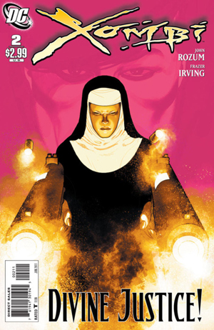
The second book picks up with David Kim in the grip of a deadly Snow Angel, waiting on a young nun-in-training-with-religious-super-powers named Catholic Girl to save his ass by blowing off his left arm. Not to worry, though: nanotechnology in David’s cells will rebuild the arm by pulling raw materials from his environment.

Rozum’s characterizations and dialogue take a front seat once again, quickly drawing you into a setting and story so absurd that – if handled even slightly incorrectly – could dip into laughably ridiculous. The writing strikes very close to the perfect balance with that absurdity, though, absorbing you into the setting and never dropping the pace. The action beats are fun and the interactions are interesting, driven by comic timing that drew out honest laughter in me more than once.

Frazer Irving’s artwork is a nice compliment to Rozum’s script. His choice of angles does wonders to enhance the dialogue and action, and his facial expressions add that extra bit of punch to the comedic beats. I’m not a fan of the way the book is colored, though: each environment is bathed in its own monotone, which changes occasionally depending on the action to depict specific events. It’s an interesting stylistic choice, but I’d really like to see Irving’s line work with a more natural coloring style.

Xombi is an off-the-wall title for DC, and I hope the series has a healthy run. If you like your books fast-paced and funny, with a heaping dose of weird, give this one a shot.

Review: The Strange Case of Mr. Hyde #1

In April of 2011, IGN Comics began allowing MyIGN users to submit articles for their weekly review roundup. Any that live up to IGN’s editorial standards are be published alongside IGN’s staff reviews. Any that I write, I’ll post here, whether they get published or not.

This review was published, and included in the April 27th IGN Comics review roundup.

Story by Cole Haddon
Art by M.S. Corley


Alternate literary history is a difficult genre to boil down for mass consumption. It’s creators must walk a fine line, conjuring stories that are both referential and understandable. The League of Extraordinary Gentlemen comic books are an example of how to do this well, while the movie version shows us exactly the opposite. The Strange Case of Mr. Hyde, while solidly evocative of the former, never quite finds a firm grip on its appeal.

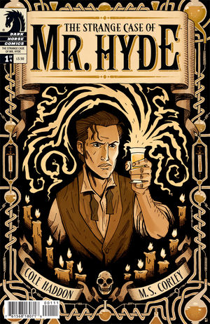
We open on the familiar story of Dr. Henry Jekyll and his infamous serum, introducing us to the origins of the titular character before skipping ahead five years. The book then takes on the story if its narrator, Scotland Yard Inspector Thomas Adye, as he attempts to unravel the the crimes of Jack The Ripper. Upon finding frightening evidence of a killer with superhuman abilities, Adye (an amalgam of several of the Ripper’s real-life inspectors) realizes he is overwhelmed and seeks the counsel of the secretly imprisoned Jekyll, thought long dead by an ignorant public.

Hyde never finds its pace, becoming bogged down in excessive (if modestly interesting) dialogue. It just plods along, hoping that hooks so obvious as to be laughable (whether intended to mislead or not) will keep readers interested. Although plenty of side references may make the literati chuckle, Haddon’s script never finds an entertaining balance. Unfortunately, Corley’s artwork is similarly flat and uninspired. The final action sequence entirely lacks motion, feeling like a series of poorly posed mannequins and failing to elicit any feelings of tension, even at its climax.

The Strange Case of Mr. Hyde is an interesting concept that’s full of almosts, but misses the mark in almost every way. Fans of this style of alternate literary fiction may find nuggets of interest, but overall it left me completely underwhelmed.

Review: Danger Girl and the Army of Darkness #1

In April of 2011, IGN Comics began allowing MyIGN users to submit articles for their weekly review roundup. Any that live up to IGN’s editorial standards are be published alongside IGN’s staff reviews. Any that I write, I’ll post here, whether they get published or not.

This review was published, and included in the April 27th IGN Comics review roundup.

Story by Andy Hartnell
Art by Chris Bolson


Anyone who’s read Danger Girl knows what to expect out of a Danger Girl comic, and the same can be said of anyone who’s seen Army of Darkness. It’s hard to make an intellectual analysis about a comic blending two properties that are so intentionally and successfully cheesy. So what happens when Abby Chase is sent on a mission to find a mysterious book on a raid in southern Africa? It can be best described by the phrase “hilarity ensues”.

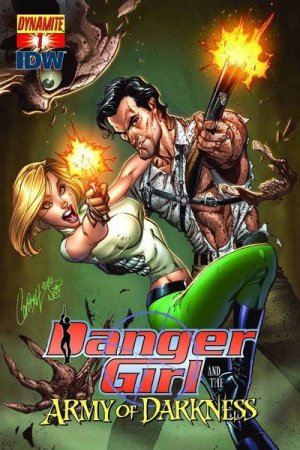
This first issue follows Abbey, recruited to rescue the kidnapped brother of her most dangerous enemy in exchange for eliminating the price on her head. It opens like a typical action movie sequel (or perhaps an episode of Human Target), by introducing Abbey and the Danger Girl organization in a shower of explosions and carefully detailed shards of shattering glass.

The rest of the book is primarily setup, and reads like the first 20 minutes of the aforementioned action flick (which is surprisingly not a bad thing). Andy Hartnell’s scripting is passably cheeseball, complete with the requisite bravado and one-liners one would expect from a book with this title. It never makes you groan, but never really makes you laugh, either. Chris Bolson’s art is straight out of a 1997 Image book, full of bright and slightly overdone digital colors. The art solidly average, with the exception of the two-page title splash, which I found rather striking.

If you’re looking for intellectual, Eisner-nominee material, you won’t find it here. On the other hand, fans of either of the two series that combine in this book will find a fun, brainless action romp. I’m interested to see if Hartnell can live up to the task of not descending solely into fan service as the series continues.